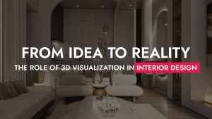
Colors speak the language of emotions. They can calm, inspire, or make you feel cozy – and it’s this magic of color that helps designers and architects to captivate clients before the project is even realized. In this article, we’ll figure out how to use the psychology of color in 3D visualization to make your work not only look stunning but also evoke the right emotions.
Color is one of the most powerful tools in the hands of an architect and designer. It can evoke emotions, change the perception of space, create an atmosphere, and influence the mood of people interacting with the interior or exterior. In the field of 3D visualization, the psychology of color is of particular importance, because it is with the help of color that you can convey not only the aesthetics of the future space, but also evoke the necessary associations and emotional response in the viewer.
In this article, we’ll look at how color psychology works in 3D visualization, what basic rules architects and designers should consider, and how colors help to convey the project concept to the client at the development stage.
In real life, lighting, materials, and textures affect the way we perceive objects and space. However, in 3D visualization, the main burden falls on the correct use of color and light, as they create the first impression. A potential client who is considering a visualization of a future interior or building cannot yet touch the materials, feel their texture, or appreciate the smell of wood or fresh air from the window. His imagination is formed precisely through the color palette and composition of the image.
Colors evoke certain emotions in people, regardless of culture or individual preferences. That’s why professionally executed 3D visualization should take into account the basics of color psychology to effectively convey the architect’s and designer’s intentions.
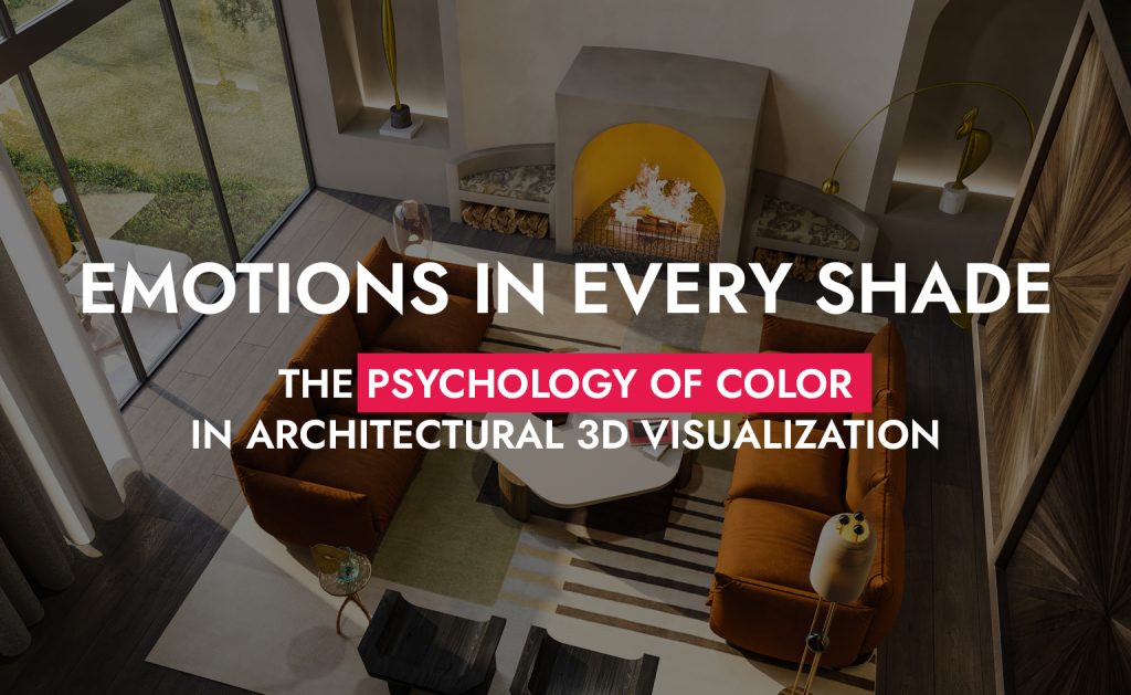
Warm and cool colors: influence on the perception of space
Warm colors (red, orange, yellow) usually evoke a feeling of warmth, energy, and hospitality. They make a room look smaller and more cozy, creating a chamber atmosphere. For example, 3D visualization of a living room with warm colors enhances the impression of home comfort.
Cool colors (blue, blue, green) evoke associations with freshness, calmness and spaciousness. They visually “expand” the room, making it more open and light. In the visualizations of modern office spaces or bathrooms, cold colors often help to create a sense of purity and minimalism.
Light and dark shades: creating contrast and mood
Light colors reflect more light and make the space look more open. The use of pastel shades in 3D visualization helps to create airy, light interiors that are associated with freshness and purity.
Dark colors add depth, intimacy and drama. Black and gray palettes, dark green or deep blue colors are often used in visualizations of luxurious, status interiors to emphasize the elegance and restraint of the design.
Accents and color contrasts: focusing attention
Adding bright accents to neutral spaces draws attention to specific design elements. In 3D visualization, it can be a red sofa in a minimalist white room or a yellow wall in a restrained office. Contrasting solutions help the viewer focus on key details, emphasizing the features of the concept.
The color should match the functional purpose of the room. For example, in a 3D visualization of a child’s room, it is advisable to use bright, cheerful colors that stimulate the child’s imagination and energy. And for the bedroom, it is better to choose soft, calm colors that promote relaxation and rest.
The psychology of color in 3D visualization is not just about choosing pleasant shades. It is a deep work with emotions, associations, and behavior of future space users. The ability to choose the right palette allows architects and designers to create convincing, emotionally charged 3D images that not only demonstrate technical solutions but also tell a story about the comfort, coziness, or luxury of the future space. By successfully integrating knowledge of color psychology into your 3D projects, you can not only impress your clients, but also make your work truly effective and catchy.
Drop us a line or give us a ring. We love to hear from you!
Necessary cookies are absolutely essential for the website to function properly. These cookies ensure basic functionalities and security features of the website, anonymously.
Functional cookies help to perform certain functionalities like sharing the content of the website on social media platforms, collect feedbacks, and other third-party features.
Performance cookies are used to understand and analyze the key performance indexes of the website which helps in delivering a better user experience for the visitors.
Analytical cookies are used to understand how visitors interact with the website. These cookies help provide information on metrics the number of visitors, bounce rate, traffic source, etc.
Advertisement cookies are used to provide visitors with relevant ads and marketing campaigns. These cookies track visitors across websites and collect information to provide customized ads.
Other uncategorized cookies are those that are being analyzed and have not been classified into a category as yet.